Graphic designs shall serve a purpose. Tell your story through colors, motifs, and textiles that match your vision. What do you want to feel when looking at your work? What impact do you want to make?
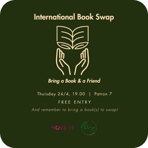
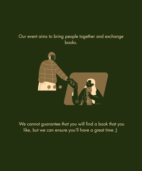
The event was inspired by National Book Day and was focused on the importance of reading books whilst also respecting the environment. Thus, the event wasn’t so much about buying books as valuing the ones people have already given up for someone else to read.
Given that it is an event that can easily be repeated due to its inspiration, I thought of a design that includes two basic principles:
Nature-Simplicity
Nature was used as an element to emphasize the environmental impact the event had in mind. The green background and the use of a book design resembling a pair of leaves were the means to encapsulate that successfully.
Simplicity was used as a means to capture people’s attention on social media and outside, since there were also flyers used. In busy environments, such a tactic often assists in this purpose and also further helps events that may repeat in the future, since the audience will not struggle to remember them.
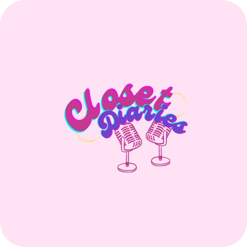
Starting as a fun Greek podcast focusing on books, movies, and everything art, Closet Diaries needed an identity that could successfully encapsulate it.
Thus came the logo, wishing to achieve just that. Something fun, open, and “funky” that will make the audience understand the vision of those who started it.
The podcast is being led by two women, which is shown through the two microphones. Similarly, the word “Closet” and the word “Diaries” are also divided by two different colors, implying the same message. To make it more customised, the colors chosen fit the preferences of the two leads of the show, whilst also showcasing the more feminine and young character of it.
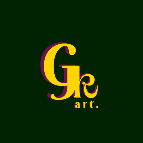
Gkalini Art
A logo created to promote an artist’s work. Its focus is to hint at the nature of their art, which mainly uses traditional methods but with a modern design in mind.
As such, the colors used are deep greens, yellows, and fuchsia.
The font family, on the other hand, wishes to showcase a more structured character whilst also maintaining a hint of creativity.
Thus, while the main font family uses harsh and straight lines, it is also based on curvier aesthetics.
Art Exhibition Event
The main focus of this promotion was not only to showcase the event, but also the artist.
Thus, one of his works became the main element of the promotion, and the text colors were all based on the artwork.
The struggle with this specific design was to find a font family that can fully support the Greek language. An important detail when it comes to a well-thought-out design.
Honorable Mentions
/Art Exhibition Event, using the artist’s work as the main element.